This is a topic that has come up a number of times as some of the Blinks play testers have different forms of color blindness. I am a strong supporter of design decisions that favor accessibility, which is so commonly the better experience for all users. For this reason, I would love to have a good solution for making Blinks color blind friendly.
I believe there are a couple of hurdles, so let me list the few that I see:
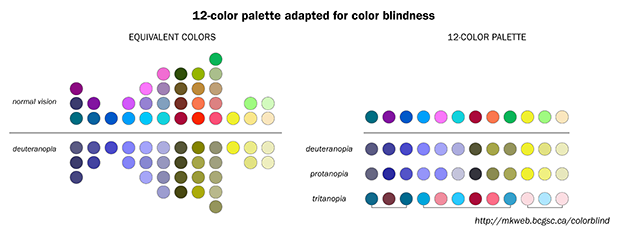
There are multiple types of colorblindness, what is the most accessible palette?
What is the minimum number of clearly differentiated colors necessary for most games? Feels highly variable based on the game.
I don’t like the idea of allowing users to change the color palette in the commercial version, it should just work. With games in dev, it would be nice to have a suggested palette, but one aspect that I think is important for game differentiation on Blinks is unique color palettes for games…
Lastly, I believe the kinds of animations (i.e. fades, pulses, blinks) should help games read for all users, but when color is critical to game play, perhaps it should have to pass the check of a uniqueness color palette for all.
Let me know your thoughts. I’d love to test out a bunch of different options here.
I love Blinks. As a colorblind (CB) person, it was a little frustrating to not be able to differentiate the tiles by color. But color isn’t what makes Blinks compelling, the system design the game concepts, do. The system would work equally well with simply numbered white tiles that can blink. Colorblind folks like me can still play it, but I would suggest that the aid that you provide be a non color aid. It could be tactile, visual (e.g. numbers), or top shape. The reason that additional color cues would be problematic is that there are, as you pointed out, a number of types of CB, and within each type, there may be wide variation. So I’m a protanope, and I do have difficulty with red. But I’m pretty sure I can see some red. Whereas other protanopes may see even less. Furthermore, color saturation matters, so often different colors of the same saturation appear to be the same. I suspect that without color studies, which might never fully address the challenge CB people have, there isn’t a good solution. Because there isn’t a solution. But other cues would build user loyalty in these groups. CB people would be thrilled to have an overt accommodation.
Jonathan, were you intending (if not, please consider this a request) to have a standard set of pre-defined #defines of color choices (both colorblind and not colorblind) available in the OS for developers? Adding this to the OS will not take up any additional memory footprint but will be much appreciated!
An accessibility document which covers all accessibility Blinks-related (including the pre-defined OS colors) is also requested.
@kenj this is the line of thinking I started with, but @ajchepaitis does provide really great points around it not being so simple. That said, it seems like a set of #defines that are distinguishable for a number of CB folks would be great. Anyone up for the task? That’s a Pull Request that will quickly make its way into the repo
Such a cool conversation! Color vision is super complicated, as there are several variables to account for. They include variations in people’s color perception as well as variations in the colors being presented.
If there is a hardware solution - changing the tiles to emit colors everyone can see - that would be good. But I don’t think it is possible, or necessary. Furthermore, it might require a controlled experiment with subjects from each color blind population. It just seems like a huge headache.
You could just prototype tactile covers to the blinks.
Quite frankly, given that color blindness is a rare condition, one also has to consider where this effort is in the list of priorities. I’m not saying that it isn’t important, but we could always just mark them ourselves.
You are welcome to use the ELIA Frames tactile font. The new numbers would be better than a letter.
The other thing is, from a color perspective, the Blinks are beautiful even to a color blind person, so the commercial appeal is there and enjoyed while using them. It’s just challenging to discern some of the color differentiation. I like the warm glow and the patterns and changes.
Alrighty, I found the tools to at least make the proposed color palette that @kenj suggested. Also, if you are a designer and looking for a really cool app to make your designs CB friendly too, check this out. So simple, so great !
Proposed first 5 CB friendly colors:
// Colorblind Safe Color Palette

// 3 distinct colors
#define  TURQUOISE     makeColorRGB(  27, 158, 119)
#define  BURNT_ORANGE  makeColorRGB( 217,  95,   2)
#define  LILAC         makeColorRGB( 117, 112, 179)

// another 3 distinct colors

#define  HOT_PINK      makeColorRGB( 231,  41, 138)
#define  PEA_GREEN     makeColorRGB( 102, 166,  30)
#define  PERIWINKLE    LILAC // arguably more lilac but hey, nice to have the option :)

// a set of 4 distinct colors
// source: http://colorbrewer2.org/#type=qualitative&scheme=Paired&n=4
#define  LIGHT_BLUE    makeColorRGB( 166, 206, 227)
#define  DARK_BLUE     makeColorRGB(  31, 120, 180)
#define  LIGHT_GREEN   makeColorRGB( 178, 223, 138)
#define  DARK_GREEN    makeColorRGB(  51, 160,  44)
These colors are defined for most LCD screens, our Blinks LEDs need to be fine tuned, so some experimentation here will be necessary.

 !
!