Since the Blinks, by design, have a little light leakage from 1 pie slice to the next, this does become a bit of a trial and error exercise and there are a few ways to go about it. The game Puzzle101 or Astro are good references as they both have colors randomly assigned to faces that can be adjacent and affect each other (not to mention that color perception is influenced by the colors next to them).
For prototyping sake, there are some nice color tools here in the forum like this color picker and likely for your own purposes, it would make sense to do a sort of Paintbrush action to test colors.
While you can try colors from existing games, in the 30 published games so far, we’ve pushed for unique color palletes and animations to give the games their own visual identity and personality. I can imagine this solution being partially in the color choice as well as in an animation. i.e. Puzzle101 confirms that two colors match by syncing their brightness, and beginners often need confirmation that there are in fact only 3 colors in that game when the interaction of colors can make it feel like more.
I am sure others would like to weigh in with their own tips, as there is both a science and an art to this
we talked about this on discord a while back. There’s really no way to stop the “bleed” affect. Sometimes it can be helpful with fluid UI and animations, other times it hurts when you want stark contrast between faces.
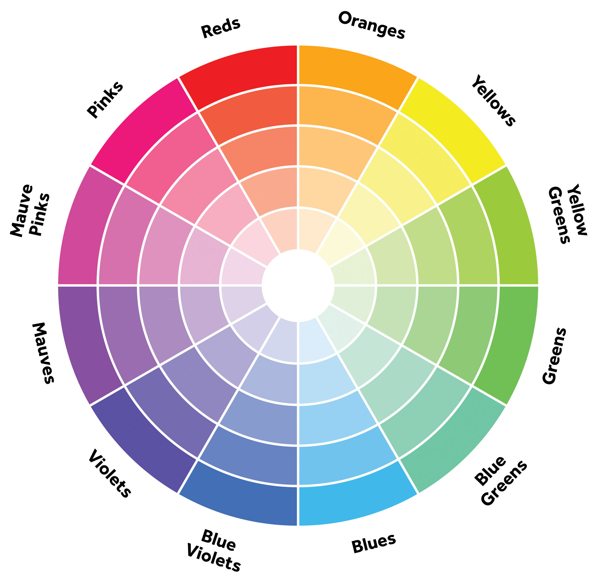
If you need more distinction between face colors, I’ve used something as simple as a color wheel in the past for determining which colors to use.
The good news out of bad news here, is that my current version of the game I needed this for, no longer uses half of the colors it was using, and It freed Red Yellow Green and Blue up to be used in the game proper, rather than in a “Click to select your player color” function.
While I hate to see that go, it solves “bleed” in my immediate game, and also gives me back a button function, that, suffice to say has a much better purpose in its new role.
and keep in mind that different patterns and animations can be used to differentiate between pieces and states when different colors could otherwise bleed together or mistakenly be seen as the same if they’re similar.